
 Hi, I am Gregor Hohpe, co-author of the book Enterprise Integration Patterns. I work on and write about asynchronous messaging systems, distributed architectures, and all sorts of enterprise
computing and architecture topics.
Hi, I am Gregor Hohpe, co-author of the book Enterprise Integration Patterns. I work on and write about asynchronous messaging systems, distributed architectures, and all sorts of enterprise
computing and architecture topics.
Find my posts on IT strategy, enterprise architecture, and digital transformation at ArchitectElevator.com.
One advantage of working for a relatively large organization is that I get to do a little more writing again. Not because I have spare time, but because in times of rapid change, communication across a large audience is critically important. It turns out, short papers are a good way to achieve that and my brief, but accurate technical position / decision papers have become a trademark of my architecture group (don't worry, we architects produce more than just paper).
Correspondingly, one of my daily struggles is to convince others to write as well and to coach them to become better writers. In a sense, this forces me to transport what I know about writing from purely procedural knowledge, i.e. I know how to do it, to declarative knowledge, i.e. being able to understand why it is done and to describe to others how to do it.
While this rambling's title is a pun on the popular books "Japanese for busy People", it intentionally implies an ambiguity that we are both writing for a busy audience, but are busy authors as well.
Writing is a tough business because writing takes so much more effort than reading, but the written word has distinct advantages over the spoken word:
Consequently, writing pays off once you have a large (or important) enough audience. The catch is that while you can to some extent force people to (at least pretend to) listen to you, it's much harder to force anyone to read your stuff. I always remind writers that "the reader is by no means required to turn the page. He or she decides based on what they read so far." Hey, I am writing this only in the hope that people will read it because they find it useful. Assuming the topic and focus of the paper are correct, i.e. the readership has a fundamental interest in reading the paper, I have repeatedly observed a classic non-linear relationship between the quality of writing / editing and the actual readership, which is a good proxy metric for the impact, or the "pay-off" of writing a technical paper. If the paper does not meet a minimum quality bar, e.g. it is verbose, poorly structured, full of typos, or displayed in some ridiculous, difficult to read font, people won't read it at all, meaning impact is near zero. I call this the "trash bin" zone to make the outcome blatantly obvious. You may euphemize it to "shelfware zone", but the impact remains the same: zero. Once the paper reaches a certain quality threshold, people will in fact read at least part of the paper and impact starts building. As so often, additional quality initially brings rapid improvement, but then quickly tapers off as it approaches the infamous "gold plating" zone.
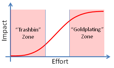
The biggest debate I tend have with my colleagues is where the sweet spot or "tipping point" is. It will certainly depend on what you are writing and for whom, but in corporate communications I posit that it is further to the right than most authors believe. Key influencers are very busy people and tend to shy away from anything that is more than 5 pages long, unless it is from a high-paid consultancy, in which case they make someone else read it. For this impatient readership, clarity of wording and brevity are not nice-to-haves: their lack will quickly put your paper quite literally into the "trash bin" zone. Unsubstantiated claims will do the same: I recently saw an internal presentation where the first slide stated "only technology ABCD has proven to be a viable solution". My immediate response: "great, show me the proof!" Sadly, no proof existed due to lack of time and funding. These are not wording issues, but fatal flaws. I no longer want to see page 2 if I cannot trust page 1.
When Bobby and I wrote "Enterprise Integration Patterns", the publisher told us about the importance of the "in the hand" moment, which occurs just when a potential buyer picks the book from the shelf and gives a quick glimpse to front and back cover, maybe the table of contents, or leaves through the book (back in 2003 people still bought books in physical book stores). The reader makes the purchasing decision at this moment, not when he or she stumbles on your ingenious conclusion on page 326. This is one (but not the only) reason why we included a lot of graphics in our book. About 80% of all facing pages contain a piece of graphic: an icon (aka "Gregorgram"), a pattern sketch, a screen shot, or even a UML diagram. This sends an important message to the potential reader that the book is not academic, but pragmatic and approachable.
The same is true for technical papers to be read not by academics, but by a corporate audience. Use a clean layout, insert a handful of expressive diagrams, and, above all, keep it short! We limit our internal papers to 5 pages (at 11pt sans serif font this equates to 2000-2500 words, about the length of this rambling), with the inevitable occasional exception.
To assess what a short paper will "feel" like to the reader without wasting printer paper, I zoom out my wysiwyg editor far enough that all pages appear on the screen. I can't read the text anymore, but can see the headings, diagrams, and overall flow, e.g. the length of paragraphs and sections. This is exactly what a reader will see when flipping through your document and deciding whether to start reading. If they see and endless parade of bullet points, bulky paragraphs or a giant mess, the paper will leave "the hand" quite quickly as gravity teleports it into the trash bin.
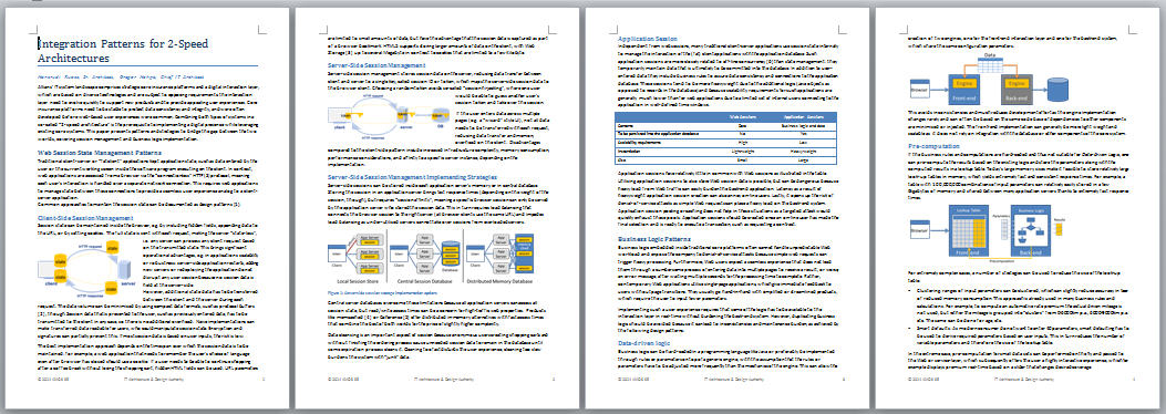
This example paper has a lot of diagrams, which is good. However, their visual style is somewhat inconsistent. Also, some diagrams are wrapped by text while others are isolated. All in all the paper looks interesting, but probably a little too "busy".
Most animated movies have to entertain multiple audiences: the kids who love the characters and humor plus the adults who had to shell out thirty bucks to take the family to the movies. Great animated movies like "Shrek" manage to address both audiences without boring the other. They will laugh at different scenes without being distracted by each other. Many technical paper also have to address a broad and diverse audience: some readers will look for technical detail while others are more interested in key decisions and recommendations. While challenging, a few mechanisms can help make everyone happy:
After a good first impression, your readers will start reading your paper. Because trying to condense all good advice on technical writing into a blog entry would be preposterous, I like to refer my colleagues, who are mostly non-native speakers, to the book Technical Writing and Professional Communication for Non-Native Speakers (it appears out of print, but you can fetch a used copy for a few Dollars - I only have the second edition from 1991, so I can't comment on how similar it is to the first edition). It covers a lot of ground from the very basics, but I like the sections on parallelism and paragraph structure best because the fast reader benefits significantly from these simple tricks.
Parallelism in lists demands that all list entries follow a similar grammatical structure, e.g. all start with a verb or an adjective. A counter example would be:
System A is preferred because:
You are simply using too many of your reader's brain cells just to parse the text instead of focusing on your message. Parallelism is not only useful in lists but also in sentences, e.g. when drawing analogies or contrasting. Technical Writing and Professional Communication for Non-Native Speakers includes many good examples of this.
Paragraphs should focus on a single topic and introduce that topic right at the beginning, like this very paragraph: readers can glean that this paragraph is about paragraphs even if they only read the first word. They can also rest assured that I don't start talking about lists or grammar halfway through, so if they feel they already know how to write a good paragraph, they can safely skip this one. This also implies that "It is further important to note that..." makes for a very poor paragraph opening.
For solid document structure I tend to point colleagues to The Pyramid Principle, even though I jest that the author must have been unsure how to spell "hierarchy" and safely opted for "pyramid" instead -- to me the logic inside the books is clearly about hierarchy of content. Pyramids stand in Egypt. This book tackles another enormous challenge in technical writing: your subject is very unlikely to be single-dimensional, but your text has to be 100% linear: one word after the other.
While somewhat over-hyped and over-priced, I do appreciate the book's sections on order. The author highlights that every list or grouping should have an order, which is either by time (chronological), structure (relationships), or ranking (importance). "How is this ordered?" has become a standard question when I review documents including a list or grouping.
Another pet peeve of mine is the usage of the word "this" as a stand-alone reference. As programmers we understand the dangers of dangling pointers and NPE's, but many seem not to apply the same rigor to writing. Too many sentences simply state that "this is a problem" without being clear what "this" actually refers to.
In technical writing, your readers are not out to appreciate your literary creativity, but to understand what you are saying. This implies that less is more when it comes to word count. While Walker Royce's book Eureka!: Discover and Enjoy the Hidden Power of the English Language spends a good part of the book musing about English words, the advice on brevity and editing is sound and the citation from Zinsser on the usage of "I might add," "It should be pointed out," and "It is interesting to note." fitting: If you might add, add it. If it should be pointed out, point it out. If it is interesting to note, make it interesting. The book gives many concrete suggestions on how to replace long-winded expressions with single words.
In our team's internal editing cycles we routinely cut word count by 20-30% despite including additional material or previously missing detail. To the first-time author this may be shocking, but Saint-Exupéry's adage that "perfection is achieved not when there is nothing more to add, but when nothing is left to take away" is especially true for technical papers. When this type of cruel editing was first bestowed upon me by a professional copy editor I felt that the document no longer sounded "like me". Over the years I have come to appreciate that being crisp and accurate is a great way to have a document sound like me.
The most effective vehicle for improving technical papers is to hold a writer's workshop, see this short description or this long description for more detail. Writer's workshops have people read and discuss the paper while allowing the author to listen, but not intervene. This simulates what happens with a paper in real life. Too often I have to remind authors that we cannot distribute them personally with every copy of their paper so that they can explain to the reader what was really meant. Because writer's workshops are time-intensive we tend to restrict them to papers that have gone through an initial review for comprehensibility, but are expected to have a large and diverse audience, justifying the extra effort.
Producing high-quality position papers can lead to an unexpected amount of organizational head-wind. The word "perfection" quickly comes up with an invariably negative connotation. Other teams claim that their "agility" spares them from any need to produce documentation, notwithstanding the fact that those teams have no running code to show either. Agile software development places the emphasis on producing working code that is worth reading, but multi-year IT strategy plans are unlikely to manifest themselves in code alone. This is where a document that is worth reading will provide the most value. Alas, such documents seem to be even more difficult to find than good code.
I would like to thank Olaf Zimmermann for the fruitful discussion at ECSA 2014 that inspired me to write down my thoughts on writing for busy people.


 Gregor is a cloud architect and author. He is a frequent speaker on asynchronous messaging,
IT strategy, and cloud.
Gregor is a cloud architect and author. He is a frequent speaker on asynchronous messaging,
IT strategy, and cloud.