
MAR 22, 2010
 Hi, I am Gregor Hohpe, co-author of the book Enterprise Integration Patterns. I like to work on and write about asynchronous messaging systems, service-oriented architectures, and all sorts of
enterprise computing and architecture topics. I am also an Enterprise Strategist at
AWS.
Hi, I am Gregor Hohpe, co-author of the book Enterprise Integration Patterns. I like to work on and write about asynchronous messaging systems, service-oriented architectures, and all sorts of
enterprise computing and architecture topics. I am also an Enterprise Strategist at
AWS.
My blog posts related to IT strategy, enterprise architecture, digital transformation, and cloud have moved to a new home: ArchitectElevator.com.
A few years ago, the Enterprise Architecture Summit in Crested Butte once again proved that sticking a bunch of geeks into a remote town and injecting alcohol into the mix can lead to very impressive results. In our case, it was an A-Z list of 26 new development strategies, starting with ADD – Activity Driven Development and ending on ZDD- Zero Defect Development. DDD was allocated in honor of Eric Evans as "Domain Driven Design". However, I have become convinced that another DDD could compete with this choice: Diagram Driven Design.
When I talk about Diagram Driven Design, I don’t mean generating code from UML diagrams. As I declared before, I am pretty firmly rooted in the UML as Sketch camp. And if people don't give too much about my opinion, I simply quote Grady Booch, who remarked that "The UML was never intended to be a programming language." Instead, I am talking about a picture that conveys one or more important concepts -- the proverbial big picture instead that does not get caught up in details. So you could also call what I am about to propose Sketch Driven Development and knock off two letters of the development alphabet.
 I recently created and taught a class on presentation skills for engineers. The presentation
starts with the usual ideas of using strong, impactful visuals, inspired for example
by books like Presentation Zen. iStockPhoto, referenced in that book, turned out to be a good place to invest fifty bucks (beware
of the free offer – the selection of free images is very limited. Also keep in mind
that your pre-paid credits expire after one year). I now have high-resolution graphics
of confident managers, fuel gages indicating that your mileage may indeed vary, shoes
that apparently do not fit all, and so on. Still, however impactful fancy graphics
may be, for most technical presentations a wide stance, deep voice, and Steve Jobs-like
hand gestures (turtleneck optional) are unlikely to cut it. Instead, you need meat:
what design alternatives did the team have? How do they differ? What are the main
building blocks of the systems and how do they interact? How did you track down that
performance bottleneck and what can we learn from it? When Garr Reynolds came to Google
to give a talk, he acknowledged that technical discussions often require detailed
diagrams or even snippets of source code. He suggested to provide such detailed information
in form of a hand-out instead of including it in visual aids. While that’s sound advice,
your technical presentation will likely be composed of one or more of the following:
I recently created and taught a class on presentation skills for engineers. The presentation
starts with the usual ideas of using strong, impactful visuals, inspired for example
by books like Presentation Zen. iStockPhoto, referenced in that book, turned out to be a good place to invest fifty bucks (beware
of the free offer – the selection of free images is very limited. Also keep in mind
that your pre-paid credits expire after one year). I now have high-resolution graphics
of confident managers, fuel gages indicating that your mileage may indeed vary, shoes
that apparently do not fit all, and so on. Still, however impactful fancy graphics
may be, for most technical presentations a wide stance, deep voice, and Steve Jobs-like
hand gestures (turtleneck optional) are unlikely to cut it. Instead, you need meat:
what design alternatives did the team have? How do they differ? What are the main
building blocks of the systems and how do they interact? How did you track down that
performance bottleneck and what can we learn from it? When Garr Reynolds came to Google
to give a talk, he acknowledged that technical discussions often require detailed
diagrams or even snippets of source code. He suggested to provide such detailed information
in form of a hand-out instead of including it in visual aids. While that’s sound advice,
your technical presentation will likely be composed of one or more of the following:
Tufte already put bullet points through the grinder. According to a recent Tweet, every time you use a bullet point, Ed Tufte kills a kitten. Let's hope not. Finally, Death by PowerPoint was immortalized by none less than Dilbert as early as 2000. You also can't fit a lot of source code on a slide, especially if you are using a verbose language with checked exceptions. That leaves you with diagrams. I believe that diagrams are by far the most useful out of the three, both in a technical presentation or a hand-out.
 However, it's reasonably safe to say that the visual damage caused by Visio's default
10 point font size and skimpy line width coupled with poor user judgment is not far
behind that of endless bullet points. Once again, it's not the tool that is the main
issue here, but how it's being used. Visio's default settings make for fine engineering
schematics, but are not suitable to project the proverbial big picture on the wall.
However, it's reasonably safe to say that the visual damage caused by Visio's default
10 point font size and skimpy line width coupled with poor user judgment is not far
behind that of endless bullet points. Once again, it's not the tool that is the main
issue here, but how it's being used. Visio's default settings make for fine engineering
schematics, but are not suitable to project the proverbial big picture on the wall.
This insight prompted me to create a sequel to my presentation skills class, which explains how to create good technical diagrams. The module covers basics like legibility (sans serif fonts of decent size), good color contrast, and alignment, before explaining how to maintain visual balance, use a consistent visual vocabulary, or omit unnecessary details to emphasize the essentials. While I was putting this presentation together, I recognized that many of the techniques that make a good diagram also contribute to good system design in general. Diagram-Driven Design can in fact improve your application architecture! Let's see how.
Visual Vocabulary and Viewpoints
Good diagrams use a consistent visual language. A box means something (for example, a component, a class, a process), a solid line something else (maybe a build dependency, data flow, or an HTTP request), and a dashed line something else yet. No, you don’t need a MOF and rock-solid semantics, but you need to have an idea what you are depicting how. Picking this visual vocabulary is important to define the aspect or architectural viewpoint of the system you are going to concern yourself with. Are you going to talk (or draw) about source code dependencies, run-time dependencies, call trees, or allocation of processes to machines? Good design is often tied to the ability to think in abstractions. Diagrams are personified abstractions and can be instrumental in this process.
Limit Levels of Abstraction
When reading technical documents, one of the most frequent problems I encounter is a wild mix of different levels of abstraction (the same problem can be found in source code). For example, someone may explain the way configuration data affects a system’s behavior like this:
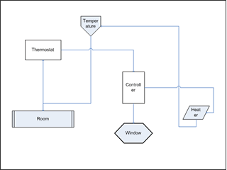
The system configuration is stored on an XML file. The “timetravel” entry can be set to either true or false. The file is read from the local file system or alternatively from the network. If it’s read from the network, you need to have NFS access. The parser is a SAX parser because it’s more memory efficient than a DOM parser. Application code accesses these settings from the “Config” class. This class is a singleton because...
In these few sentences we learn about the file format, project design decisions, implementation detail, performance optimizations and what not. It’s rather unlikely that a single reader is actually interested in this smörgåsbord of facts. Drawing a picture forces us to clean up our thinking, lest we run out of paper. Do we depict the data flow, the class structure, or implementation detail? While a picture does not automagically make this problem go away, it puts it in your face much more than a meandering chain of prose, which from afar may not look all that bad. A well-known German proverb proclaims that “Papier ist geduldig” (paper is patient), meaning paper is unlikely to object to what garbage you scribble on it. Diagrams tend to be a little less patient, and expose a wild mix of metaphors and abstractions more easily.
With any diagram or description, it's good to remember that it's simply a model of the system, not the actual system. So it's OK to use a bit of artistic license. The opening paragraph of "Data and Reality" aptly reminds us that "rivers do not have dotted lines in them and freeways are not painted red".
Reducing to the Essence
Limiting the levels of abstraction is only one form of mental scope control. You may have seen the billboard-size database schema posters, which include every single table and are impressive, but fairly useless, especially when shrunk down to fit on a single presentation slide. Omitting unimportant detail to concentrate on what's relevant to your message can make a huge difference here.
Balance and Harmony
Limiting the levels of abstraction and scope does not yet guarantee a useful diagram. Good diagrams lay out important entities such that they are logically grouped, relationships become naturally clear, and an overall balance and harmony emerges. If such a balance does not emerge, it may just be that your system does not have one. I once sat down to review a relative small module of code that consisted of a rather entangled mess of classes and relationships. When we tried to document this module, we just could not come up with a half-decent way to sketch up what's going on. After a lot of sketching and erasing we came up with a picture that resembled a data processing pipeline. We subsequently refactored the entangled code to match this new system metaphor.Degrees of Uncertainty
When we look at a piece of code, we can always figure out what was done, but it's much harder to understand why it was done. It can be even more difficult to understand which decisions were made consciously and which ones simply happened. When creating diagrams, we have more tools at hand to express these nuances: for example, you can use a hand-drawn sketch instead of an engineering drawing to convey that the picture is the basis for discussion as opposed to the ultimate truth. Many books use this technique effectively, including Eric Evans' Domain-driven Design.
Diagrams are Art
Diagrams can (and should) be beautiful – little works of art, even. Writing can certainly also be artistic, but looking for that beautiful prose in a technical document is bound to be a rather disappointing exercise. I am a firm believer that system design and architecture has a close relationship to art and (non-technical) design. I do have a copy of Machine Beauty firmly planted on my bed side table, but learning purely by osmosis has so far not been successful, so I'll have to come back to that topic in the future.
Both visual and technical design start with a blank slate and virtually unlimited possibilities. Decisions are often influenced by multiple, usually conflicting forces. Good design resolves these forces to create a functional solution, which attains a good balance and some degree of beauty. This may explain why many of my friends who are great (software) designers and architects have an artistic vein or at least interest.
As always, bad diagrams outnumber good diagrams by some margin. Bad diagrams are not a useful design technique. They may not even be useful, period. Drawing a lame picture will not make your poor design any better. Likewise, beautiful marchitecture diagrams usually have little do with the actual system being built, and are also of limited value (drawing up the real system and placing it side-by-side with the marchitecture probably does have some value).
In technical discussions I have observed many occasions where drawing a diagram has greatly improved a conversation and the resulting design decisions. If you are unable to draw a good diagram (and it isn't due to lack of skill), it may just be because your actual system structure is nothing worth showing to anyone.
Share: Tweet
Follow:
Follow @ghohpe
![]() SUBSCRIBE TO FEED
SUBSCRIBE TO FEED
More On: DESIGN MODELING WRITING ALL RAMBLINGS


 Gregor is an Enterprise Strategist with Amazon Web Services (AWS). He is a frequent
speaker on asynchronous messaging, IT strategy, and cloud. He (co-)authored several
books on architecture and architects.
Gregor is an Enterprise Strategist with Amazon Web Services (AWS). He is a frequent
speaker on asynchronous messaging, IT strategy, and cloud. He (co-)authored several
books on architecture and architects.